The font you choose for your blog or website is one of the most important design decisions you can make for your blog.
But, if you’re a new blogger you probably don’t want to invest a lot of money into a premium font, and many themes won’t even allow you to easily upload custom fonts.
The great news there are tons of free fonts that look great and are easy to install, especially if you’re on WordPress.
But, all fonts – even really great fonts – are not one-size-fits-all.
What do I mean by this?
Different styles of fonts elicit different feelings and match different blogs better than others. For this reason, you should try to choose fonts that match your blog’s brand personality or even blog niche.
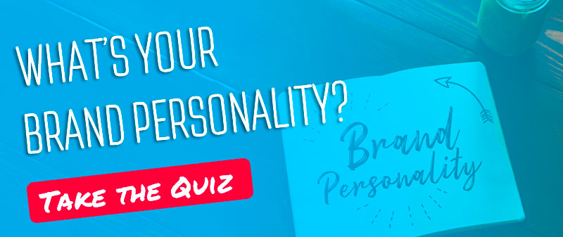
If you’re not sure what brand personality you’re blog fits into, check out my article on how to determine your brand personality.
In the meantime, here’s a quick cheat sheet of the different brand personalities and their keyword descriptors. Also, a quick rundown of how to choose fonts that match your brand.
Down to Earth
Honest
Wholesome
Cheerful
Simple
Handwritten
Easy-to-read
Daring
Young
Imaginative
Up-to-date
Bold Fonts
Brush Fonts
All Caps
Reliable
Intelligent
Successful
Technical
Simple
Easy-to-read
Title Case
Upper class
Glamorous
Charming
Smooth
Cursive/Ornate
Handwritten
Classic/Vintage
Outdoorsy
Tough
Bold
Gritty
Bold Fonts
Brush Fonts
All Caps
What are Font Pairings?
As you look through the recommendations, you’ll notice that I have created recommendations for both header font and body font.
This is because your header text – the text used for the titles and subtitles of your blog post- is typically larger.
You can use more complicated, decorative fonts that enhance your blog’s brand for headlines.
Body copy is going to be smaller (typically no bigger than 14pt) and in larger chunks of text.
To make it easier for your audience to read, body fonts should be simpler – typically serif or sans-serif fonts in regular weights. 9 out of 10 websites use sans-serif fonts.
Ok, now without further ado… let’s get into the nitty gritty.
20 Free Font Pairings Using from Google Fonts
Google Fonts is great because it’s super easy to install them into your WordPress blog and they are free to use!
One downside to Google Fonts though is, because they are free many other bloggers are using them as well. This means your blog will look a little less unique.
That’s why I’ve tried to find great font pairings from Google that are more unique to help you stand out.
The Classic
Works Best for Sincere, Competent and Sophisticated Brands. This font combination is one of the more common ones you could choose, but there is a reason for this… it’s because it looks so great and is super versatile!
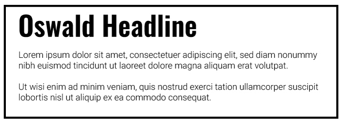
Headline: Oswald
Body: Roboto Light
Oswald is featured on more than 7,100,000 websites. Roboto is featured on more than 21,000,000 websites.
Bookish Font Pairing
Works Best for Sincere and Competent Brands. I imagine this font pairing would work amazingly in a niche-focused around books. Crimson Text is a less popular font whereas Merriweather is the most popular serif font on Google Fonts.
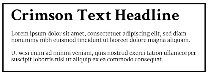
Headline: Crimson Text
Body: Merriweather Light
Crimson Text is featured on more than 450,000 websites. Merriweather is featured on more than 3,300,000 websites.
Modern & Technical
Works Best for Competent brands. Could also be used for sincere brands.
This font pairings gives off a techy vibe so it would work well for blogs in a technology niche, i.e. programming, drones, cell phone photography.
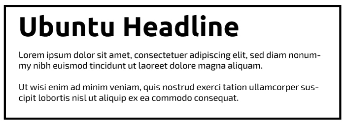
Headline: Ubuntu
Body: Exo 2
Ubuntu is featured on more than 1,500,000 websites. Exo 2 is featured on more than 350,000 websites.
Good Clean Fun
Works best for Exciting and Sincere brands. The smooth, round, but simplistic nature of this font lends itself to both exciting and sincere brands. Quicksand reminds me of a refined Comic Sans. Open sans on the other hand is one of the most popular Google fonts because of how easy-to-read it is.
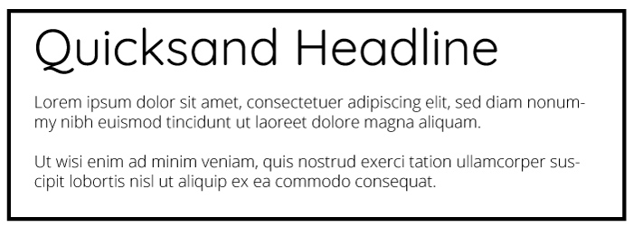
Headline: Quicksand
Body: Open Sans
Quicksand is featured on more than 740,000 websites. Open Sans is featured on more than 21,000,000 websites.
Adventurous
Works best for Exciting and Rugged brands.Bungee is a simple all caps font that comes in only one style, so it’s not as adaptable as some of the other font pairings in this list. It can work really well for rugged outdoor brands though, or even as a font for your logo. Roboto Light is my personal favorite body copy font, it’s also very popular.

Headline: Bungee
Body: Roboto (Light)
Bungee is featured on more than 17,000 websites. Roboto is featured on more than 21,000,000 websites.
Rugged & Outdoorsy
Works best for Rugged and Exciting brands. Could also work for sincere brands. Staaliches is an all-caps display font that comes in only one style, so it doesn’t have a ton of versatility on that front. However, it’s not overplayed on the web so it can really help your blog stand out from the crowd. Lora is a simple serif font.
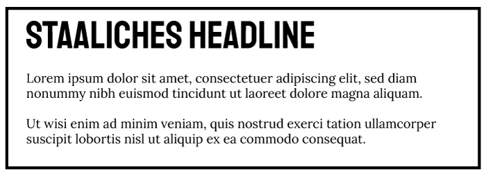
Headline: Staaliches
Body: Lora Regular
Staatliches is featured on more than 11,000 websites. Lora is featured on more than 1,400,000 websites.
Western Vibes
Works best for Rugged brands. The Bevan typeface really reminds me of an old west font. Like many display fonts, it only comes in one style (regular). PT Sans Regular is a popular easy-to-read sans-serif font.
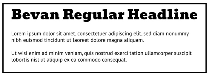
Headline: Bevan
Body: PT Sans Regular
Bevan is featured on more than 130,000 websites. PT Sans is featured on more than 1,800,000 websites.
Simple Sophistication
Works best for Sophisticated and Competent brands. Comfortaa is a clean round font that can work well for both sophisticated and competent brands. Roboto is one of the most popular Google fonts – for good reason – it’s easy-to-read, looks great, and is very versatile.
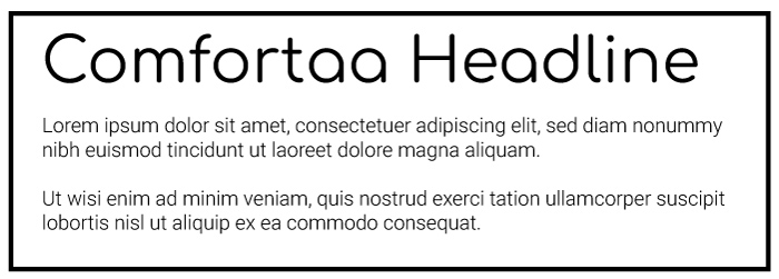
Headline: Comfortaa
Body: Roboto (Light)
Comfortaa is featured on more than 370,000 websites. Roboto is featured on more than 21,000,000 websites.
Letter Writing Font Pair
Works best for Sophisticated brands. Rochester is a cursive writing font that only comes in one style (regular). It can work really well for feminine sophisticated brands, and also even sincere brands due to the handwritten vibe. Lora regular is a popular easy-to-read serif font.
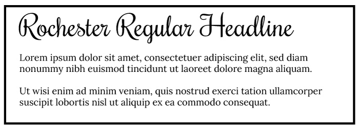
Headline: Rochester
Body: Lora Regular
Rochester is featured on more than 67,000 websites. Lora is featured on more than 1,400,000 websites.
Traditional Font Pair
Works best for Competent, Sincere brands. This is another simple serif font pairing. It can work for just about any brand, but particularly competent and sincere brands. Both Libre Franklin and Karla are very versatile fonts.
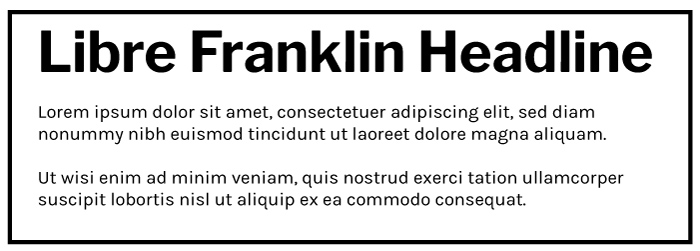
Headline: Libre Franklin
Body: Karla Regular
Libre Franklin is featured on more than 640,000 websites. Karla is featured on more than 610,000 websites.
Handwriting Font Pair
Works best for Sincere & Exciting brands. Sedgwick Ave was designed with handwritten graffiti in mind, but in a different context it looks like a simple handwritten font. Sedgwick comes in only one style. I’ve paired Sedgwick with Open Sans, a popular and versatile sans-serif font.
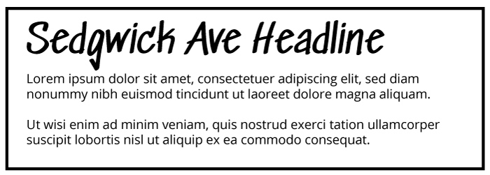
Headline: Sedgwick Ave
Body: Open Sans
Sedgwick Ave is featured on more than 8,100 websites. Open Sans is featured on more than 21,000,000 websites.
Modern Cowboy
Works best for Rugged & Exciting brands. Lilita One is a bold font with round edges, make it a perfect match for brands that want to emphasize elements like: fun, boldness, outdoorsiness, youthfulness. Lato Regular is a great compliment for body text.
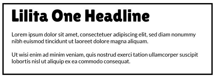
Headline: Lilita One
Body: Lato Regular
Lilita One is featured on more than 20,000 websites. Lato is featured on more than 10,000,000 websites.
Informal Fun Font Pair
Works best for Exciting and Rugged brands Permanent marker is a bold handwritten font. It only comes in one style and should only be used in larger font-sizes. It does have a more masculine quality to it, so keep that in mind if you’re trying to appeal to women.
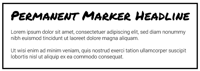
Headline: Permanent Marker
Body: Roboto (Light)
Permanent Marker is featured on more than 210,000 websites. Roboto is featured on more than 21,000,000 websites.
Feminine Sophistication Font Pair
Works best for Sophisticated and Sincere brands. Arima Madurai was designed to have soft edges and a calligraphic feel. These attributes make it perfect for blogs with a large female audience. The font has a variety of type weights as well.
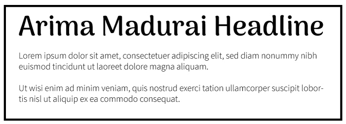
Headline: Arima Madurai
Body: Source Sans Pro Light
Arima Madurai is featured on more than 23,000 websites. Source Sans Pro is featured on more than 3,600,000 websites.
Vintage Sports Font Pair
Works best for Rugged & Exciting brands. Titan One reminds me of vintage sports fonts from the 70s and 80s. It works great for masculine audiences, but only comes in one weight. Because it’s so heavy, Titan One should be used only in very large font sizes. Roboto Light is a classic clean pairing for body font.
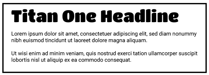
Headline: Titan One
Body: Roboto Light
Titan One is featured on more than 23,000 websites. Roboto is featured on more than 21,000,000 websites.
Gatsby Font Pair
Works best for Sophisticated brands. This font combo reminds me of a 1920s party invitation. Yeseva One only comes in one weight, so it’s not super versatile and can really only be used for headlines. Algreya Sans Regular is a less popular sans-serif font that comes in a variety of styles.
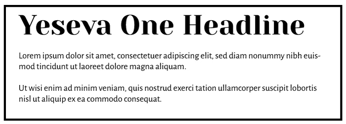
Headline: Yeseva One
Body: Algreya Sans Regular
Yeseva One is featured on more than 50,000 websites. Alegreya Sans is featured on more than 250,000 websites.
Casual Cowboy
Works best for Sincere, Competent, and Rugged brands. This is a more popular font combo that works best for simple blog designs.
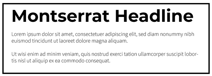
Headline: Montserrat (Black)
Body: Source Sans Pro (light)
Montserrat is featured on more than 8,000,000 websites. Source Sans Pro is featured on more than 3,600,000 websites.
High-End Magazine Font Pair
Works best for Sophisticated & Competent brands. Playfair Display reminds me of a high-end magazine like Vanity Fair. Playfair and Open Sans both offer a variety of font weights for you to choose from.
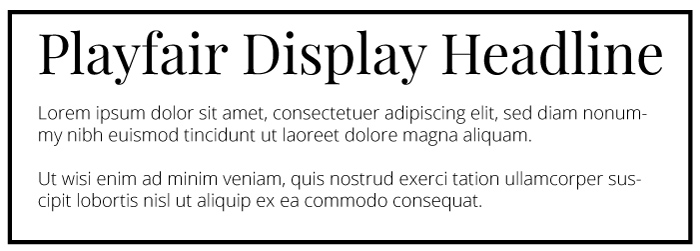
Headline: Playfair Display
Body: Open Sans
Playfair Display is featured on more than 4,100,000 websites. Open Sans is featured on more than 21,000,000 websites.
Simple & Bold Font Pair
Works best for Competent, Exciting & Rugged brands. This font combo reminds me a bit of Rolling Stone magazine.
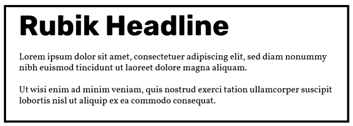
Headline: Rubik (bold)
Body: Vollkorn Regular
Rubik is featured on more than 450,000 websites. Vollkorn is featured on more than 440,000 websites.
Clean and Simple Font Pair
Works best for Competent & Sincere brands. This font pairing is great for those who want to use simple fonts that aren’t as popular on the web but still look amazing and has a wide variety of font variants. Both Chivo and Overpass fonts have multiple weights and styles.
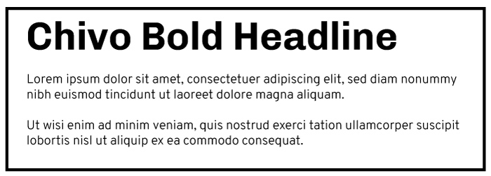
Headline: Chivo (bold)
Body: Overpass Light
Chivo is featured on more than 130,000 websites. Overpass is featured on more than 41,000 websites.
How to install your Google Font into your WordPress blog:
Scenario 1: (Most Common): If you have a theme that supports Google Fonts.
Most (good) free and paid themes include Google fonts by default and you usually edit this information in the ‘Customize’ section of your website.
Every theme is slightly different, but what you’re looking for is an option with the word “Typography” or “Fonts”
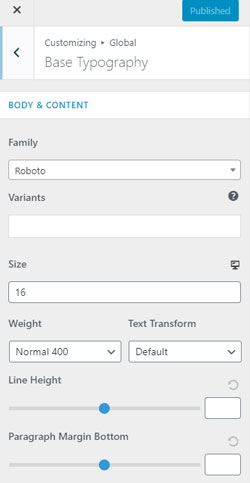
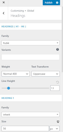
My favorite and top recommended free theme (Astra) for instance, lists the free fonts under Global > Typography and then has two options: Base Typography and Headings.
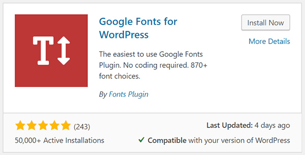
Scenario 2: If your free theme doesn’t allow you to customize fonts.
In this case, I recommend you install a free plugin. There are several out there, but ‘Google Fonts for WordPress’ worked great for me.
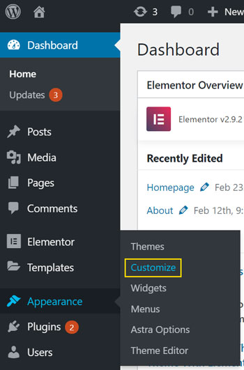
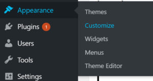
After installing this setting, simply go to your blog dashboard and select Appearance > Customize.
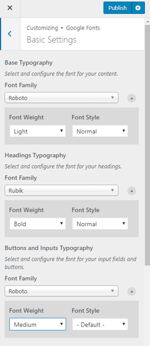
From here, you’ll see an option for Google Fonts. Select that option and then you’ll be able to select your main Font Family (body font) and your Headings Font, and font for your Buttons and Inputs.
You can be done at this step, but one quick bonus tip.
This (and many other) free Google font plugins do have their limitations. The one listed above for example only allows choosing font styles and weights.
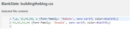
To adjust your font size, line-height, color, or letter-spacing you’ll need to get the premium option, or choose additional CSS in your theme settings and set font-weight yourself using some basic css:
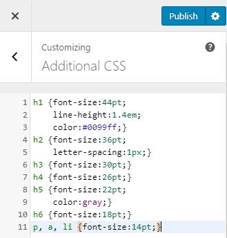
This option is listed in Appearance > Customize > Additional CSS.
h1,h2,h3,h4,h5, and h6 are your heading elements. You can alter them separately as done in the example above, or group them together with commas.
p is your basic text (paragraph) element, a represents links, and li represents your list elements.
Using font-size, color, and letter-spacing CSS properties you can easily adjust the look and feel of your Google Fonts without having to pay.
Scenario 3: If you have a free theme know CSS/HTML fairly well
If you know HTML and CSS it might be better to implement Google Fonts manually instead of using a plugin. It generally will make your WordPress site faster, and you’ll have more control.
Important Note: If you are not comfortable with HTML/CSS, I do not recommend this method. This is for those with advanced knowledge of WordPress and HTML/CSS only.
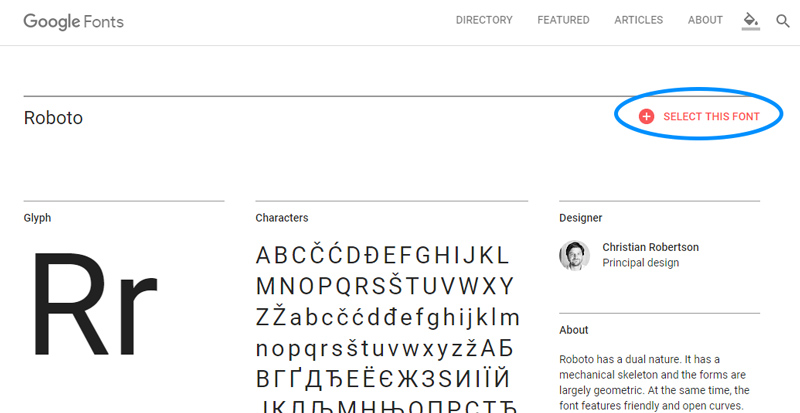
If you are though comfortable though, the process is fairly straightforward. Simply visit https://fonts.google.com/ and search for your desired font.
Once you find the font you like, click ‘Select this Font.’
From here, Google will provide you with an embed code for your chosen font.
From here, Google will provide you with an embed code for your chosen font.
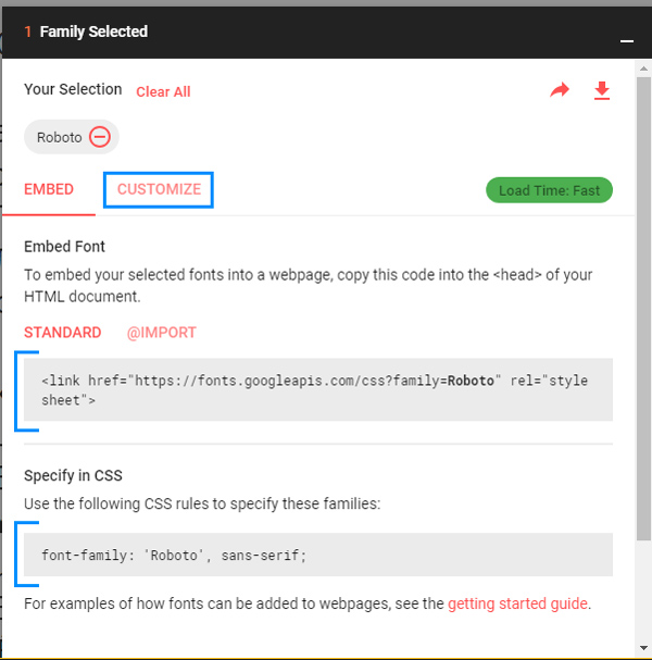
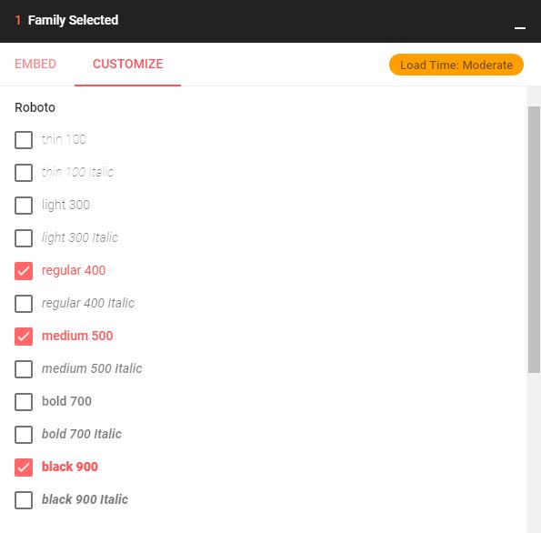
An Important Note
By default, Google will only provide you with regular/medium weight font. If you want additional styles, you need to select them in the customize tab before copying your embed code…Don’t go too crazy here though. As you add additional fonts to your website, you increase the load time for your website.
Once you’ve customized your font, take the provided embed code and input it into your blog theme’s header. This is located in Appearance > Theme Editor.
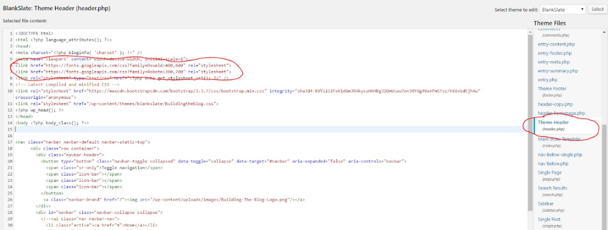
Next, specify your style either in a custom style sheet created for your theme or, in the Appearance > Customize > Additional CSS Section:
Scenario 4: If you use Elementor Page Builder
Elementor is a free page builder that is super powerful. You can use Elementor with WordPress to create custom websites, homepages, and landing pages. I highly recommend it for new bloggers.
One thing you can do is let Elementor override your fonts. Now, I still recommend setting up your fonts using your website’s customize theme.
But, this is a good option if you’re using Elementor and your theme doesn’t allow you to edit your fonts.
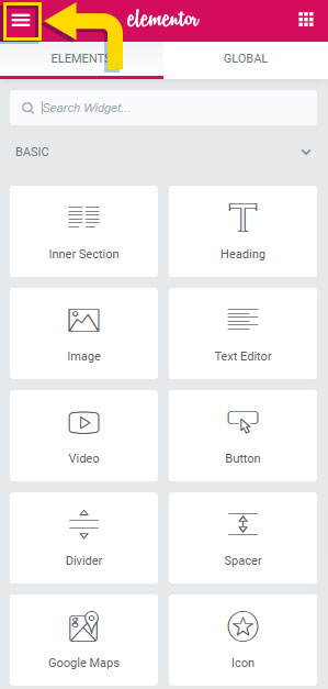
To access these options, you need to go to a page you’ve created with Elementor so you can access the Page Builder. Click the 3-line icon in the top left of the page.
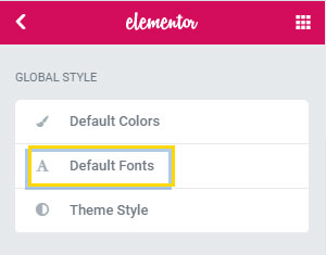
After clicking that button a new menu will appear. Click the Default Fonts Option.
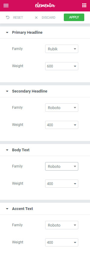
From here, you’ll have the option to change your headline, body text, and accent text fonts. It should override all theme fonts.
Scenario 5: If you have Divi Theme
The premium Divi theme makes it as simple as possible to install your chosen Google Font into WordPress.
First, ensure you have ‘Use Google Fonts’ enabled in your Divi Theme Options.
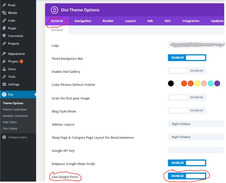
Second, select Theme Customizer from the Divi Sidebar and then click General Settings > Typography.
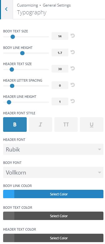
Divi is a premium theme, which means it costs money, but it provides more control without needing to get into code. So not only does it offer custom font choices out-of-the-box, but you can also specify color, size, and letter-spacing.