Most new bloggers are eager to get their blogs up and running as quickly as possible.
In the rush, bloggers don’t invest the time needed to make their blogs look professional or optimized for conversions.
Instead, most bloggers rely too heavily on themes to do the designing for them or look at other bloggers for inspiration. The problem is – most bloggers make at least one of these common blog design mistakes.
Looking at blogs from the lens of an experienced digital marketer, I’ve noticed five common mistakes both new and seasoned bloggers are making, and what they should be doing instead.
1. Over-Designing the Blog
This is by far the most common and easiest trap bloggers fall into – especially new bloggers.
I get it, I fall into the temptation myself. I want to link to my landing pages for my products, best blog articles and social media accounts – all at once.
This is fine to do in moderation, but what winds up happening is, many blogs end up looking cluttered or, what I call ‘over-designed’.
Why is an over-designed blog a problem?
Because, even if aesthetically the blog looks good, when you put the focus on everything, it makes it hard for your blog visitors to know what you want them to do.
You can get away with this more if you’re pulling in a lot of traffic and have multiple revenue streams. But, if you’re just beginning, don’t make the mistake of strategizing like a bigger blogger. Start small. Choose one main goal and drive traffic toward that goal.
Maybe you want to link to an affiliate product you have success with. Then, on your homepage make sure you have a sticky link to blog articles that relate to that affiliate link.
In most cases on your home page you want to take your customers on a journey toward your end-goal (usually either signing up for an email list, purchasing a product from an affiliate or purchasing one of your products).
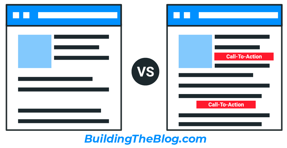
A simple blog design allows you to put an emphasis on the action you want your users to take.
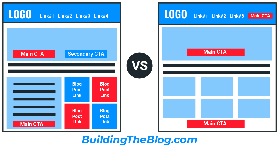
See the difference in the examples above? While most designs can be aesthetically pleasing, with the option on the right your main call-to-action button stands out much more easily. This helps keep your visitors from getting distracted by links that don’t relate to your main call-to-action.
White space is not your enemy, nor is a simple color scheme. Contrast is your ally when it comes to drawing users’ attention to what you want them to do next.
2. Not Thinking About Your ‘Information Architecture’
Some of you may be wondering, “what is information architecture”?
Information Architecture (IA) is just a fancy schmancy marketing term that refers to how your website links to all of the other pages of your site. In other words, it’s the map visitors use to navigate your site.
The thing is, most bloggers just don’t know what information architecture is, and if they do, many don’t spend much time worrying about it.
Why is it so important to get your blog’s information architecture right?
Because the easier it is to navigate your site, the more likely your site visitors will stay on your site AND find what they’re looking for.
It’s also your way of directing visitors toward the specific actions you want them to take.
How do you create a good information architecture?
This can be a very complicated question. But, I personally think you can get 80% of the way toward perfection with the simple answer (in most cases).
First off – there are 3 main components that you need to think about when designing your information architecture:
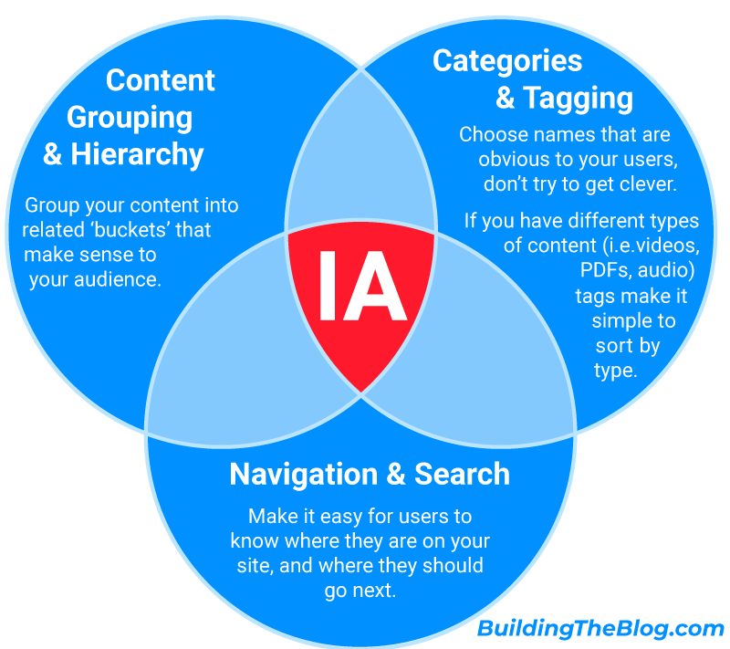
- Content Grouping As you write posts and create pages for your blog they should fit into 3-5 main ‘buckets’ of content. There are definitely blogs that have more – but for the most part, 3-5 is a good rule of thumb. If you have lots of content – you can also have sub-categories under the main categories – for most new bloggers though, this is overkill.
- Labeling and Tagging Think of this as what you are naming the 3-5 content groups you’ve identified above. You don’t want to get too cute with names here. Keep it simple and easy for your audience to understand.Additionally, this component can involve tagging your content by ‘type.’ I.e. is the content a blog post, podcast, video, PDF, etc. If you have lots of types of content you should make it easy for your users to find content by type.
- Navigation & Search Navigation is the way you link to your content – for most websites this is a navigation bar at the top or side of all pages.In addition to helping users easily find the content they’re looking for, the navigation system should also make it obvious to users where they are on the website – especially if you have subcategories to your main categories.One of the ways to do this is via breadcrumbs. You should also have search – I’ll touch more on this later in the post.
So – that being said, how can you create a good information architecture?
Your information architecture should do two things in order to be successful. One, support the goals of your users. Make it easy for them to find the information they want.
And two, support your goals as a blogger in terms of producing sales and generating new leads.
What are some ways to make sure you have a good information architecture:
You should be thinking about your information architecture before you even start to create your site. This is the first thing I did when I started BuildingTheBlog.com. I wrote down the main topics I had expertise related to building blogs and then related them back to what my target audience would be interested in.
These topics became the driving force behind my main and secondary navigation. Just thinking about your information architecture from multiple perspectives will put you ahead of most other bloggers.
Think about how you plan to monetize your blog.In the beginning, I plan to only attempt making money through affiliate links. Therefore, I needed to think about how to drive traffic toward helpful posts related to these affiliate links.
If you have your own product, you’ll probably want to make sure you have a clear link in your navigation and on your homepage pointing people toward your most popular product or a CTA that points them towards a lead nurture email.And, if you simply want people to sign-up for your email list or follow you on social media, you should have links that support this goal in your main nav and on your home page.Don’t pick all three of these options though.If you do you’ll end up with the over-designed blog that I talked about in mistake #1.
Research your current traffic and siteflow using Google Analytics.
As your blog evolves and you gain traffic, you should start to see traffic patterns emerge.Hopefully the content you’ve invested a lot of time in creating and expected to be popular is attracting the most visitors.But maybe a surprise pattern emerges and you find out that something else you’re writing about is more popular.
For example, right now BuildingTheBlog is mostly about creating a blog from scratch and conversion design. But, I also plan to write a few articles on color theory and how it relates to branding your blog.
If I were to check my site analytics and find that articles on color theory are outperforming the ones on blog creation – I might want to consider highlighting color theory in my information architecture.
It might also be the case that your visitors aren’t clicking on some of your blog posts because they’re hard to find or not named properly. If that’s the case, experiment with your navigation naming and/or position and see if this improves your click-through-rate for some of your less popular blog posts.
TL; DR; You should always be looking at the type of content your audience craves, create more of it, and make it as easy as possible for them to find.
This is what makes a great information architecture.
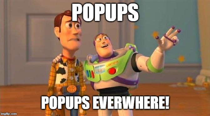
3. Ads and Popups EVERYWHERE
Oh my goodness… For me personally, this is probably the worst and most frustrating mistake I see bloggers make.
There are some blogs that are downright unusable because of the number of ads and popups on a website. Especially on mobile.
When it comes to ads, unless you’re getting tens-of-thousands of visitors to your website every month, you’re probably not making enough money from them to justify what it’s costing your reputation. Not only do ads look spammy (especially popup ads), but they also slow down your website. This is likely going to frustrate your audience and cause them to exit your website.
As far as popups go, I’m a big believer in good UX, and I’ve just never a well-implemented pop-up. And, yes, this includes the exit popups that are all the rage on blogs nowadays.
First of all, the hover-over mouse exits on WordPress blogs fail half the time and show up when someone is simply scrolling through a webpage.
But, more importantly, if someone subscribes to my blog or content, I want them to do it because they’re engaged in it and want to learn more.
I highly recommend focusing on creating genuine relationships with your blog rather than forced ones.
Pro Tip: If you are going to use ads or popups, at the very least, test them on mobile to make sure your website is still usable. Many popups on mobile will block the whole screen and make it so that users cannot browse the blog.
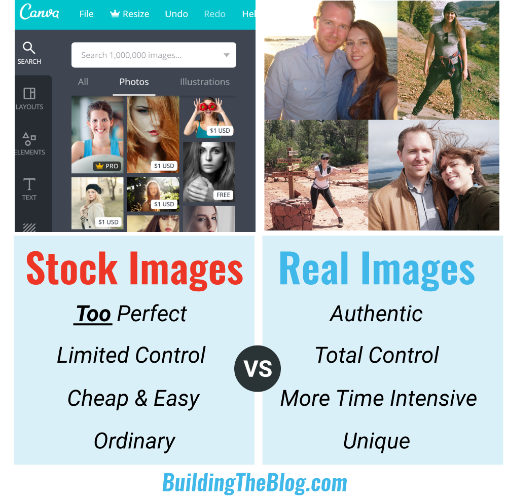
4. Using Stock Images For Everything
I have to admit to being a bit biased on this one, I absolutely detest stock images. To me, they are immediately detectable, come off as fake and immediately cheapen a blog’s brand.
I know this is going against the grain a bit. A lot of bloggers recommend using stock images. And, I’ll admit I have used stock images when I’m in a pinch… but if you want your blog to stand out from the crowd, try to use your own images.
How can you do this?
Take your own photos or create your own icons and graphics.
That’s what I’m doing for this site. Not only does it make it obvious that the blog is run by a real person and builds a connection with your audience, but you also never have to worry about paying for licensing fees or violating copyright laws.
5. Not having a relevant Call-to-Action on every single page
I know this is a tough one because it takes a lot of work. But, having a clear call-to-action that is relevant to every single one of your blog posts is the difference between blog success and failure.
Just driving traffic to your website isn’t enough. You need to give people a reason to connect with you. This means creating specific call-to-actions so that each blog post has a relevant CTA.
Especially when you’re starting out, it’s a good idea to keep all your blog topics closely related. This makes it easier for your blog posts to share the same relevant call-to-action.
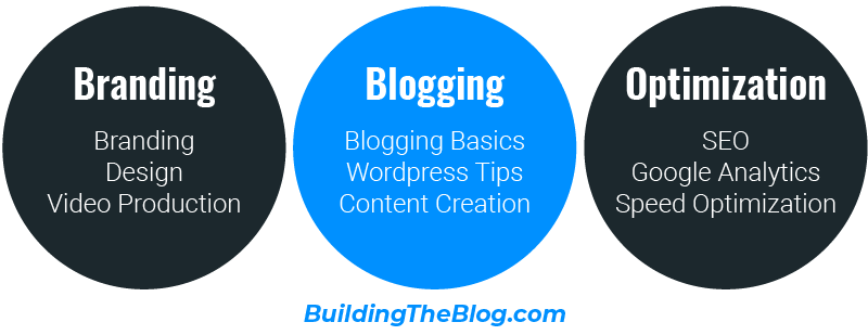
I have a specific call-to-action for each of my three main blog categories (branding, WordPress, and SEO & Analytics).
Pro Tip: Make sure to sprinkle in your call-to-action throughout your posts and pages. Not just at the end of a post. And, in addition to buttons, work the CTA into a text link in your post.
Hi everyone! Thanks for reading, I hope you enjoyed this post! Let me know in the comments below if you have any questions.
And, I’d love to hear your thoughts on other blog design mistakes you see bloggers making.