Your brand colors are usually the first design element visitors notice when loading your website for the first time. Learn how to choose brand colors that wow your audience and help make your blog brand more memorable!
In this blog post, we’ll first go through the basic factors to consider before finalizing your color choice. Next, I’ll show you how to build your own custom color scheme from your research.
Now, the good news is, there really is no “wrong” or “right” color palette for your brand, but there are colors that will work much better for your brand and target audience than others.
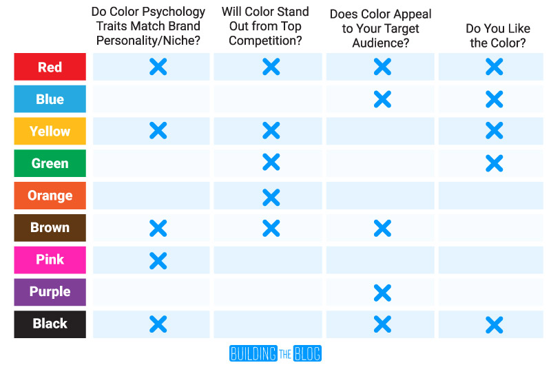
To determine what colors best fit your brand, there are four things to consider:
- Basic Color Psychology
- Colors Used by Your Competition
- Your Target Audience’s Preferred Colors
- Personal Color Preference
Using Color Psychology to Choose Colors
The idea behind color psychology is that certain colors have subliminal meanings associated with them.
This due to everything from evolution, to how colors are experienced in our lives, to the traditions we grew up with.
For example stop signs and warning labels are often accompanied by the color red so in certain contexts we associate this color with danger.
However, red is also associated with love and passion – think of all the hearts and red roses you see in stores around Valentine’s day.
Every single color has meanings associated with it based on a broad set of shared experiences.
Keep in mind as I go through this list though – this relates primarily to western cultures like the United States. Other cultures often have their own unique traditions that impact color meanings.
Red: Passion, Love, Anger, Warning, Excitement, Danger, Heat
Orange: Sun, Fun, Warmth, Youth, Food, Excitement, Creativity, Warmth
Yellow: Happiness, Optimism, Warmth, Youth, Cheerful, Cowardly
Green: New, Nature, Greed, Money, Growth, Envy
Blue: Stability, Calm, Cold, Loyalty, Trust, Masculine
Purple: Royalty, Luxury, Spirituality, Magic, Wealth
Black: Formal, Wealth, Expertise, Evil, Elegance
White: Pure, Clean, Good, Sterile
Pink: Feminine, Caring, Emotional, Love
Brown: Nature, Comfort, Dependable, Dirt, Dull, Boring
Now before we moved on, remember that we all have our own individual experiences and definitions for color. So, while color psychology is good to know – take it with a grain of salt.
Once you’ve processed the basic meanings of each color, think about your brand’s personality and what you want to represent…
Are you a fun and exciting brand? Or, are you more concerned with seeming relatable and genuine? Or maybe you’re trying to come off as the expert in your niche?
Which colors match your brand’s personality traits? Jot them down as contenders for your final brand color.


Also, jot down some colors that match your blog or website’s topic.
For example, if I were blogging about personal finance, green would be strongly related to my blog’s topic. But, my personality would be trustworthy and relatable, a color represented by blue.
But, just because blue and green work with your brand in regards to color psychology doesn’t mean you have to pick them…
There are still other color factors to consider…
What Colors Does Your Competition Use?
The next important thing to research is the primary colors used by the most successful websites in your niche.
Let’s say you do some research and find that 90% of your competition is using blue or green as the primary colors for their blogs.
You can either use this information to choose colors similar to the competition or (like me) go against the grain and choose colors that stand out from the competition.
In my case, most of the top bloggers who blog about marketing go with light, pastel, and pink colors.
In addition to researching your niche’s top competition, another handy trick is to hop on Pinterest and search for something your target audience would search.
This will produce a quick visual of what colors your competition is using to promote their blogs.
I searched ‘How to Begin Blogging’ as an example and this is what came up…
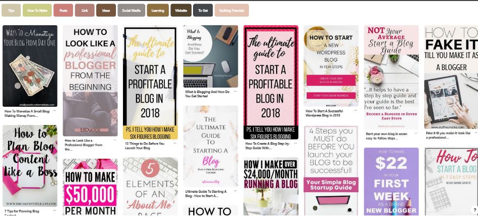
The color that immediately stands out is pink. I also see a lot of light blues/purples and yellows as I scroll through.
When I saw this, it immediately made me think of one thing…
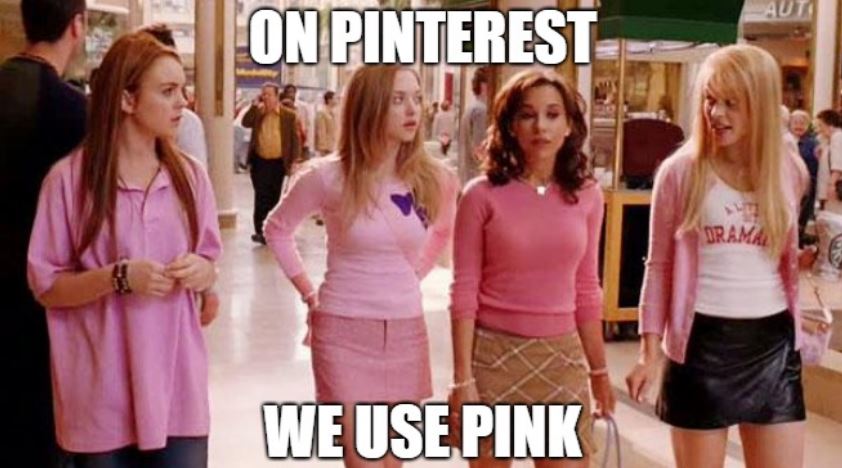
And more importantly, I thought I absolutely should avoid pink if I want to stand out from my competition.
Imagine how much more orange, blue, or green-colored blogs would stand out from those pink and pastel colors…
A research article from Color Research and Application backs-up the idea that you should choose a color that stands out from already well-established brands in your niche.
That being said… Yes, you could still create a pink blog that would appeal to your audience, but you do risk blending in with other bloggers.
Picking a color that’s similar to what other bloggers are using can help you “fake it ‘til you make it.”
Don’t worry. There is no wrong answer – the choice depends on your personal strategy. Choosing colors for your brand is both a science and an art.
But, don’t choose a color for your brand quite yet. As you zero in on a primary brand color, don’t forget to first consider who will be viewing your website…
Target Audience and Color
Your target audience in my humble opinion is the top factor in choosing a color.
Now, you don’t have to get super granular in knowing who your audience is, but you should know the basics…
Is your audience mostly female, or mostly male? Old or young? Consider the following as you finalize your choices.
Research from a survey conducted by Joe Hallock helps shed some light on color preferences between genders and age groups.
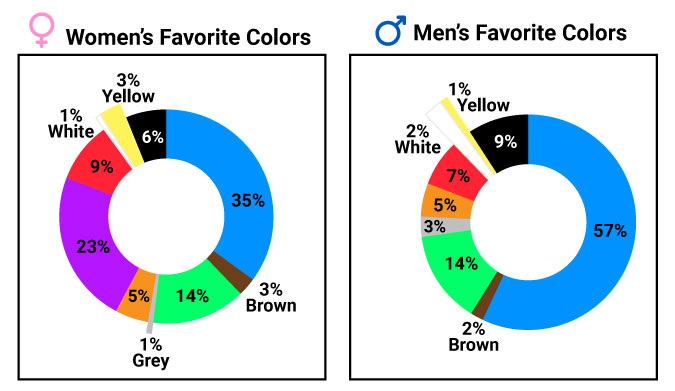
- Both males and females choose blue as their favorite color
- Purple was listed as the second-most voted for favorite color for women but doesn’t appear on the men’s list of favorite colors
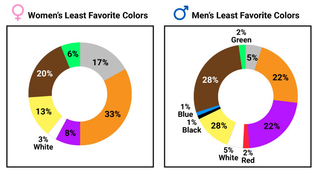
- Both males and females voted most for orange, brown, and yellow as their least favorite colors
- Men also voted for purple as one of their least favorite colors
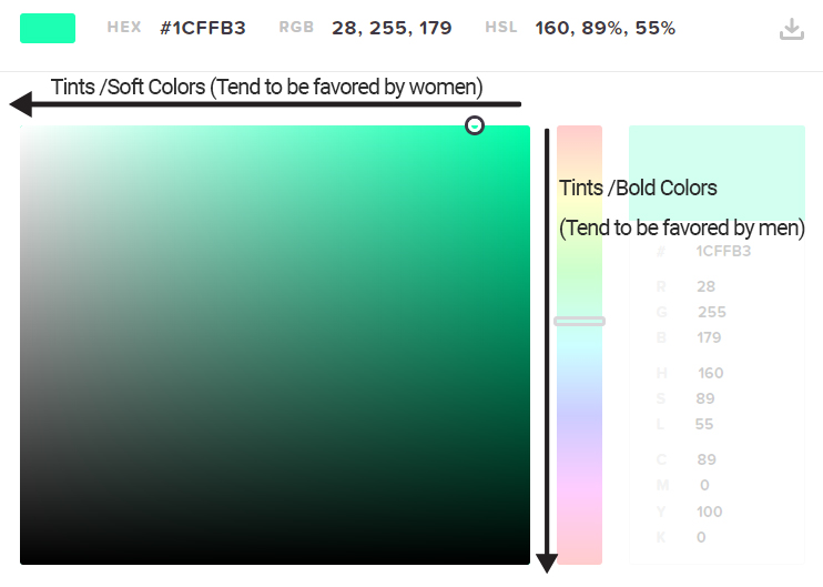
What’s really interesting about the color research regarding gender/age is that preference also has a lot to do with the variation of colors.
So, if you want your brand color to be green, you can still alter the color’s brightness and saturation to make it appeal more to men/women or younger/older audiences.
Men tend to prefer bright colors, and women, softer pastels.
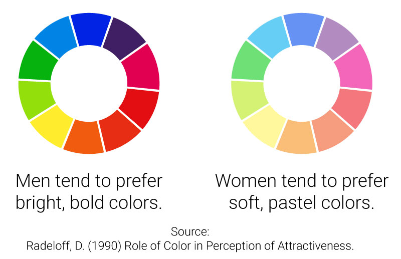
Radeloff, D. (1990) Role of Color in Perception of Attractiveness.
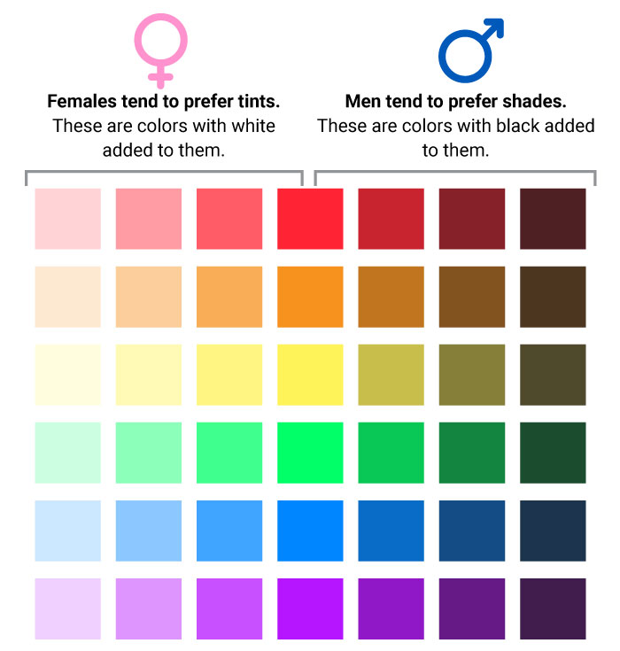
Men also prefer shades, which means darker versions of colors
Women prefer tints, which means lighter versions of a color.
Younger audiences are often marketed to using bright and exciting neon colors – think of the colors used by MTV, Mountain Dew, X-Games.
Older audiences, on the other hand, prefer more conservative colors.
Don’t Forget to Consider Your Color Preference
Before deciding on a final color, make sure it’s one you actually like.
Now, that doesn’t mean to just choose your favorite color, but if all of your research is telling you to choose the color orange and you hate the color choose the next best option.
At the end of the day, your blog brand is an extension of you, so make sure to choose a color that appeals to you. (Plus, you’ll see this color a lot as you work on your website so you don’t want to get sick of it!)
Simple 3-Step Process to Choosing a Color Palette
Once you’ve considered all of the aspects that go into choosing a color, it’s time to finalize your color scheme.
I use a three-step process for building my own color schemes. It’s super simple.
The first color is your primary color, the other is for drawing attention to your call-to-action elements (i.e. download or sign up buttons).
Why only two colors?
Because, the more colors you add to your blog, the harder it is to brand yourself with color.
Think of the most famous brands in the world: Starbucks, Facebook, Coca-Cola, McDonald’s, and Amazon. These brands are primarily associated with a max of two colors.
That’s why I recommend following the experts and keeping it simple.
Now, lets get started with building our palette.
Step 1: Choose a primary brand color.
Start by weighing the four color considerations we just talked about:
- Basic color psychology
- Competition’s colors
- Target audience
- Your personal color preference
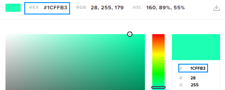
Once you decide on the basic color, you need to choose a specific hue. I like this really simple color picker from HTML Color Codes.
Play around and find a color you like. Remember to consider your target audience when you decide on how light, bright and dark your primary color will be.
Once you decide on a color, make sure to write down the 6-character hex code somewhere safe. You’ll always want to incorporate this exact color in your brand to reinforce your brand.
Step 2: Choose a Call-to-Action color that heavily contrasts with the primary color.
Your primary color should be used for the majority of your design – this is your main brand color.
But, there is another very important color you need for your brand – and that is a contrasting accent color.
Your contrasting color will be the color you use for call-to-actions. These are the buttons or links on the website you want your visitors to click.
Why? Well, there are many marketers that will tell you that your call-to-action buttons should always be green, because green means go.
Others will say buttons should be red because red indicates excitement and action.
The truth is, the best button color is the color that contrasts the most with the rest of your webpage.
This is because a contrasting color button stands apart from the rest of the website and literally draws attention to itself through color.
So, how do you choose a contrasting color?
By turning to the color wheel. Contrasting colors live on the opposite side of the color wheel as your primary color.
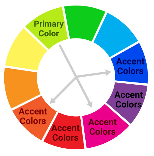
Using the same color picker tool I noted before, you can find the exact opposite color of your brand color by choosing “complementary” in the dropdown underneath the color matrix.
The “triadic” option will give you two colors that are “close-to-opposite” that will work well with your primary color.
At this point, choose one of the colors you see listed. This will be your basic color scheme. Generally, I like to pair a warm color (reds, oranges, yellows) with a cool color (purples, blues, greens).
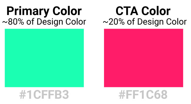
You’ll make heavy use of these colors while designing your blog.
As you start using these colors in your design, make sure to use your CTA sparingly. It’s purpose is to call attention to your buttons and things you want your website’s visitors to click.
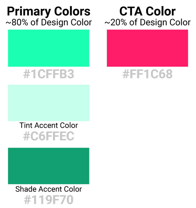
Step 3: Identify supplementary colors that are tints/shades of your primary brand color
Ok, so you have two main colors chosen for your blog now.
But, maybe you feel like something is missing? Or, maybe your color choices are both so bold you feel like your design can be overwhelming?
There is a simple trick many designers use to combat this issue.
Instead of adding a bunch of additional colors to the mix, choose a lighter tint and darker shade of your primary color.
This will ensure that your design stays on brand and reinforces your primary color.
When it’s all said and done, color is an important component of a website and of a brand.
But, don’t overthink it too much. If you go over the steps outlined in this post, you will be far ahead of the curve.
If you found this post helpful, I’d love to hear what colors you chose for your blog and why! Drop me a line in the comments section!
I am really confused about my blog color. I kept the header simple white and the footer in black. But I want to have my blog a classy look but am really confused what should I choose?
Can you suggest me a color combo for cooking blog where main audience are females?
Hi Babai – I took a look at your blog – I think the header looked great! Black and white is a great choice if you’re going for a classy/sophisticated look, and this works with both a female and male audience. The fact that you’re using a cursive font for your logo definitely appeals to a more female-heavy audience. So, I think you made a great design choice there! Your footer you could try a light gray to soften the look a bit. Another suggestion I’d have would maybe try changing your red accent color to have a more pink… Read more »