Choosing blog fonts may not seem as important to the overall design of your website as your colors or logo, but font is actually one of the most important visual elements of your blog.
Fonts are used everywhere on your website. They help set the aesthetic tone of your blog.
And, different font styles evoke different emotions to subconsciously remind your readers what makes your blog unique.
Choosing the right font is just one more way to reinforce your brand through design, so make sure you take advantage of it…
And on the flip-side, choosing the wrong fonts can leave your blog looking unprofessional and even hard to read…
The first step to choosing the right font for your blog is understanding font basics and that’s what this article is all about! So, let’s get started
The Two Main Blog Font Styles
At the most basic level, there are two basic styles of fonts.
Serif Fonts
The first and oldest font to exist in mass media is the serif font.
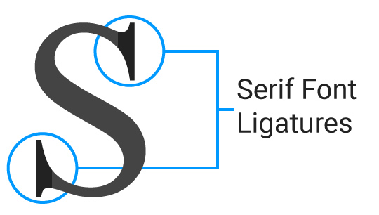
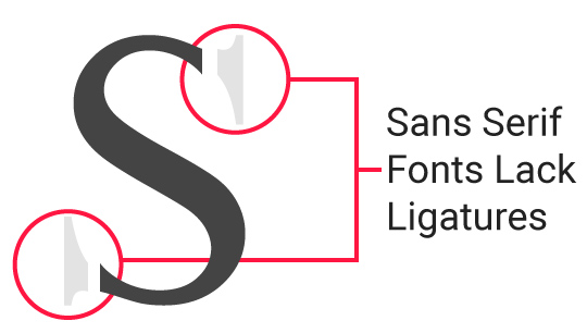
What distinguishes serif fonts are the small ligatures at the end of the longer lines of each letter.
These types of fonts are very popular in print materials such as books and newspapers.
Due to their traditional background, on the web, you often find them on news websites and other websites trying to convey a more serious, literary, or intelligent image.
Serif fonts are the classic/original font (think Times New Roman).
The serif font can fit just about any type of blogs, but if you’re trying to create a blog brand that’s fun, exciting or bold, the type could be a little boring.
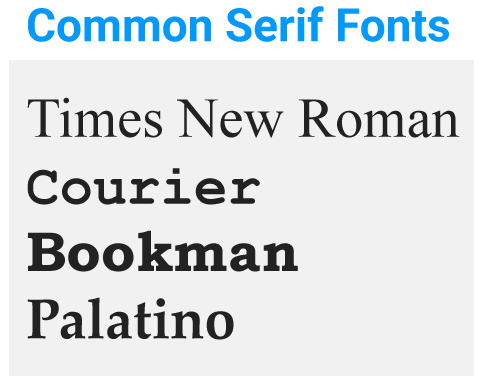
Common examples of Serif fonts: Times New Roman, Courier, Bookman, Palatino
Sans-Serif Fonts
Sans-serif fonts are the counterpart to serif fonts.
A clean modern font, serif fonts rose to popularity around the 1920s (think Great Gatsby and the roaring twenties). The emphasis with serif fonts are on clean and simple lines for each character.
The easiest way to tell whether a font is sans-serif is if it lacks decorative ligatures.
These types of fonts are very popular on modern techy websites like Google and Facebook.
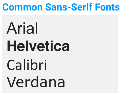
Common examples of Sans-Serif fonts:
Arial, Helvetica, Calibri, Verdana
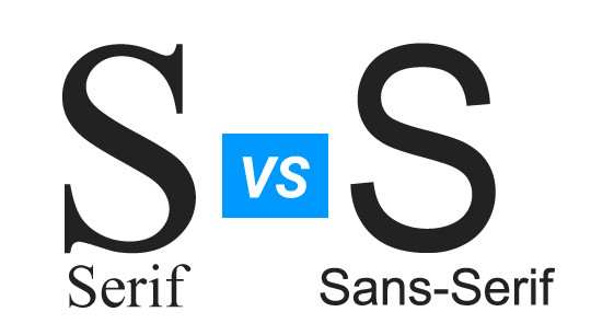
Serif and Sans-Serif fonts are without a doubt the most common fonts you’ll see on the web.
They’re both great simple choices that are easy-to-read in both large and small font-sizes.
However, if you’re looking to liven up your blog with a more decorative font, read-on for some font-types that might be the perfect match for your blog’s personality.
Decorative Font Styles
When you want to liven your blog up a bit, there are more decorative fonts to choose from.
Pro Tip: Keep these more decorative fonts to large text only or else it will be too hard for your audience to read.
There are exceptions to every rule, but 99 times out of 100, I keep decorative fonts to my heading 1, heading 2, and heading 3 tags.
Generally, smaller heading tags as well as standard web text, is too small for decorative fonts to be readable.
Below, is an outline of some of the common categories of decorative fonts – some overlap does exist between all fonts, but in general knowing the distinguishing features should help you choose the appropriate font for your blog.
Script Fonts
Script fonts mimic cursive handwriting. They’re great fonts to add some character to your blog, but should be use sparingly.
Even among the other decorative fonts on this list they can be the most difficult to read.
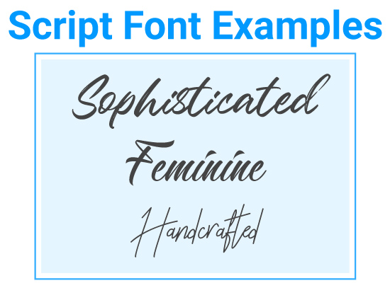
Script fonts generally work best for sophisticated and feminine blogs. They’re especially great for DIY style blogs. This is because of their ornate details.
Handwriting
Handwritten fonts can share some similarities with script fonts, but these types of fonts aren’t necessarily cursive. For this reason they can be more masculine and often appear informal.
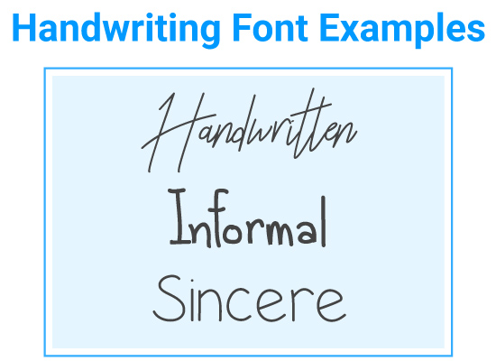
Handwritten fonts are good for informal blog niches that are trying to emphasize their sincerity.
Brush Fonts
Brush fonts are exactly what they sound like… a font that imitate writing with a paint brush or permanent marker.
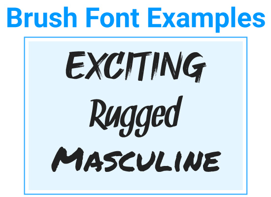
Brush fonts works great for masculine, bold, and exciting brands.
Display Fonts
Display or decorative fonts is a catch-all term for fonts that are more complicated and decorative.
These fonts are really great to use for logos. If your design skills are limited, simply search for a display font your like and you’ll have a logo!
Basically, it’s any type of font that looks great in larger font-size but is very hard to read in a smaller font.
In most cases you wouldn’t want to use these fonts on the web beyond the largest font size you use on your blog.
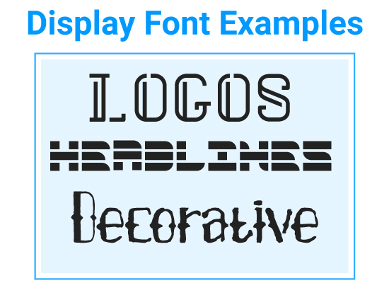
Display fonts can work great for logos or large headlines, but should be used sparingly, even compared to other decorative fonts.
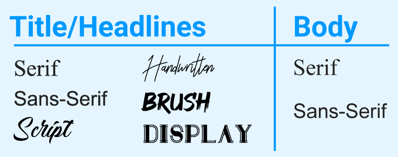
How do you know which type of font to use for your blog?
I recommend sticking to a simple serif or sans-serif fonts for your body copy. The fancier fonts are going to be harder to read in smaller font sizes.
Title and headlines are where you can get a little fancier, however, you can still stick to simple serif or sans-serif fonts if you prefer a minimalist look.
On Building the Blog, I stick to simple Sans-Serif – Montserrat for headlines and Roboto for body text.
Web-Safe Fonts vs Google Fonts vs Custom Fonts
Now that we’ve gone through the different types of fonts in detail, you might be wondering how to find fonts and add them to your website.
Web-Safe Fonts
These are the fonts that most users already have installed on their computers, phones or tablets by default. For example, Apple has a different set of installed fonts than Windows, however there are some cross-platform fonts that almost all users have.
Well-known examples include Arial, Times New Roman, and Courier.
If you’re trying to stand out, web-safe options probably aren’t the best option for your primary font, however they’re often used as fallback fonts in the event that your custom or Google fonts aren’t able to load (this rarely happens, but backups are good to have).
Google Fonts
Google Fonts are open-source fonts provided by Google for free. These fonts can be used by both personal and commercial sites at no charge.
Google also hosts the fonts for website creators.
You do have to ‘install’ the font onto your website in order to use the font which can reduce the time it takes for your website to load.
I highly recommend using Google Fonts on your website and have compiled a list of 20 great font combos for your blog from Google with detailed instructions on how to install them.
This is usually not a big deal as long as you stick to one or two fonts on your website.
Custom Fonts
Custom fonts can be purchased or downloaded from third-party providers. And, some are even free.
My personal favorite source for finding fonts is 1001fonts.com. It’s simple to search for styles, and easy to find styles that are even ok for commercial use.
Unlike Google Fonts though, if you decide you’d like to use a custom font on your blog you will need to host these fonts onto your website yourself.
The process is a little more difficult than with Google fonts, and if you’re not a web developer you’ll probably need a WordPress plugin to help you if you want to use a custom font.
If you’re thinking about going this route check out this Use Any Font plugin for WordPress.
Note that because custom fonts are hosted on your website it can be more burdensome for your site to host, and might increase page load time.
The upside to custom fonts though is, they’re less widely used than Google and Web-Safe fonts so your site will look more unique.
Alter Your Blog Fonts Further with Simple CSS
If you’re looking to make your font choice stand out even more, then you might want to alter your web fonts even more.
This is especially useful if you’re using a free font used by many other websites and you want to stand out a bit more.
On top of the obvious ways to change fonts with color, bold/italicize, and size which can all done with a WordPress editor, you can use CSS to change your text even further.
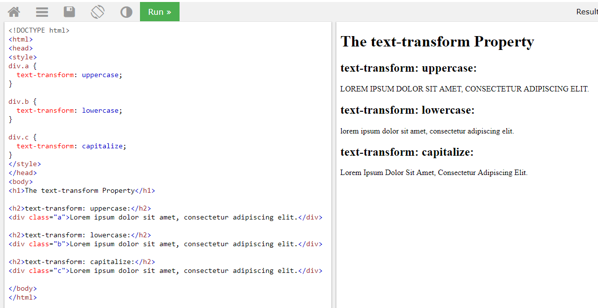
Text- Transform
Using a CSS property called ‘text-transform’ allows you to change the capitalization of specified elements on your website.
Sure, you can do this manually, but this ensures you never forget and keeps your site style consistent.
You can set these properties to certain elements in the custom CSS section of your theme. Typically under Appearance >Customize > Additional CSS.

In the example above ‘Create a Professional Blog’ was transformed to ‘CREATE A PROFESSIONAL BLOG’ with this simple syntax.
h1, h2 {
text-transform: uppercase;
}

h3, h4, h5 {
text-transform: lowercase;
}
For example, you could use this to make all heading tags ALL-CAPS, or all lowercase.
Keep in mind, text-transform can make it harder to read text. For this reason I would recommend using this property sparingly, and only for headlines.
Here are your options for transforming your text with ‘text-transform.’
Titlecase Headlines.
Titlecase headlines are the ‘grammatically’ correct way to write your blog titles. For this reason, they work great for competent brands, but can work for any brand type if preferred.
UPPERCASE HEADLINES.
All-caps fonts evoke a more bold and exciting tone and work great for rugged and exciting brands.
If you’re using simple serif or sans-serif fonts, this is a good way to make these fonts seem a little more exciting.
lowercase headlines.
Lowercase style headlines evoke informality and femininity.
They can work well for both sincere and sophisticated brands.
Also a good choice if you’re going for a minimalist vibe.
If you’re new to CSS and would like to test out how it works before editing your blog, try using W3 Schools free TryIt editor.
Special CSS Properties
Aside from text-transform
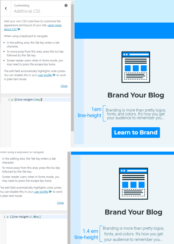
Line-Height
Line height is the spacing between the lines in a paragraph of text. I frequently use this property because I think by default most lines are too close together.
I typically set this at 1.4em or 1.6em. This makes it easier to read.
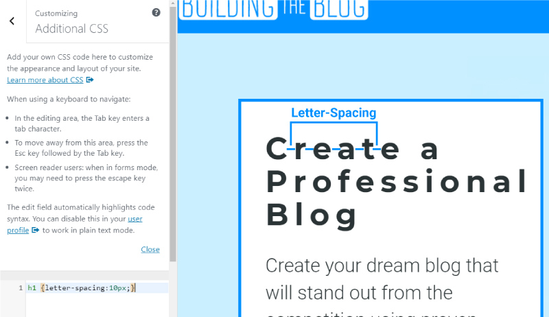
Letter-Spacing
Letter-spacing you probably don’t want to mess with for your body copy, but for headlines you can vary based on your personal preference.
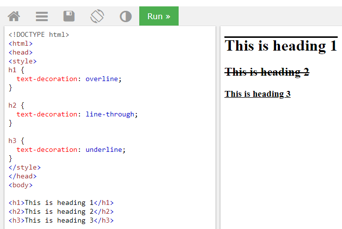
Text-Decoration
Text-decoration allows you to add a line above, below, or through text with overline, line-through, and underline settings.