Learn how to create your own blog logo for your WordPress blog or website – for free!
As you start creating your custom website or blog with WordPress, the first main design element you need is your blog logo.
Your logo is a very important part of your blog brand. For most website designs, the logo shows up in the upper-left corner of every single page of your website.
But, that doesn’t mean you need to hire a designer or invest a lot of time into your logo.
Free tools like Canva paired with some simple design techniques will help you create a professional logo that represents your brand in just 15 minutes!
Before we get into the nitty-gritty – I want to quickly explain the three types of logos you can create for your blog (and which one I recommend for bloggers)…
The Three Basic Types of Logos
There are three basic types of logo designs: Lettermark/ Wordmark, Brandmark, and Combined.
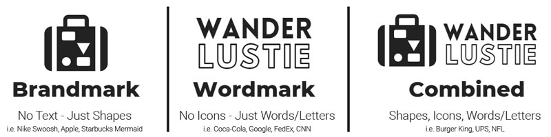
Brandmark/Logomark
A brandmark or logomark is what most people think of when they think of a logo. The Nike swoosh or Target bullseye logo.
Often brands start off displaying their name along with the symbol before being able to be represented simply by a symbol.
Examples of well-known brand marks include:
- Nike Swoosh
- Apple
- Pepsi
- Starbucks Mermaid
- Twitter Bird
- Target
Important Note: Being able to be identified from a simple symbol is the holy grail of branding. Not many companies pull this off. Bloggers can create a brandmark, but I recommend they focus first on the next type of logo…
Lettermark / Wordmark
Lettermark and wordmark logos don’t contain graphical elements and instead, rely on words or letters as their logo.
Often these logos include a special font or design element to the letters to make them appear unique.
Examples of famous lettermark and wordmark logos include:
- Coca-Cola
- Fed-Ex
- CNN
- ESPN
- Netflix
- McDonald’s
- Disney
Combined/Hybrid
Some brands incorporate their brand mark and logo mark. This is often done via an emblem or shield style look.
Common examples of well-known logos that use this Combined/Hybrid look include:
- UPS
- Burger King
- NFL
- Lay’s
- Mastercard
Type of Logo I recommend for Bloggers
This post will primarily focus on lettermark/wordmark logos.
That’s because wordmark and lettermark logos are an easy style logo to create using free design tools like Canva.
There are some free logo generators out there that will allow you to incorporate clip-art into your logo, but these logos end up looking tacky and amateurish.
That’s because these clipart style logos aren’t following the basic rules of logo design…
With that said, before learning how to create a logo in Canva, there are a few basic design rules you should know to ensure you’re making a professional-looking logo.
Basic Rules to Follow When Designing a Logo
First off… don’t overthink it. The goal of a logo is to quickly communicate your brand, not create a work of art.
You don’t need to compete with Nike, Coca-Cola or Starbucks – you simply need to create something that matches your brand and quickly lets your site visitors know what your blog or website is about.
The #1 thing to keep in mind when creating a logo is to keep it simple.
Here are some best design practices to keep in mind to help you design a versatile logo that stands the test of time…
Rule #1: Ensure your logo looks good in black & white.
As digital has taken over our world it’s easy to assume that your logo will always be experienced through a computer or phone screen. This isn’t always the case.
For example, if you ever decide to invest in some brand swag, such as embossed journals or business cards, embroidered shirts, coffee mugs, often the printer will only accept a monochrome logo.
This means elements like drop-shadows and gradients won’t be perceivable.
So, make sure when you take these elements away that you’re still left with a meaningful logo.
Rule #2: Size Shouldn’t Matter. Make Your Logo Readable, Large or Small.
When designing a logo you’re usually zoomed in and the logo is taking up most of your screen. It’s easy to forget that it will most often be viewed much smaller.
In fact – by default WordPress recommends a very small logo size of 180px by 60px.
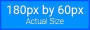
I typically make my website logos appear larger than this (my current web logo is 320px by 60px) but, I still make sure my logo is clear smaller sizes.
Pro Tip: As you’re designing in Canva, zoom out periodically to make sure the logo is still readable.
Rule #3: Make Your Logo Design Timeless
Avoid icons, imagery, and design trends that are not going to be around forever.
For example, think of how outdated a CD, beeper, USB drive, 90s computer monitor, or flip phone is today? Any logo with these elements immediately looks dated today.
This means today’s technology will probably look dated in 10 years – so try to avoid the temptation of including a smartphone or laptop icon in your logo. These designs will change before you know it.
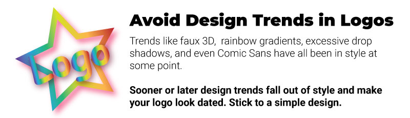
Similarly, design trends like excessive gradients, 3d effects, and rustic minimalism that were popular 5-10 years ago are starting to look outdated today.
A simple 2D logo never goes out of style.
Think of how iconic simple logos like Nike, Apple and Coca-Cola are.
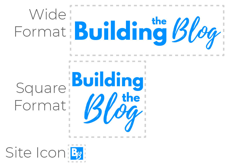
Rule #4: Keep Scalability in Mind
Your logo will need to fit a variety of sizes and shapes.
For example, a wide format rectangle logo is ideal for a website, but most social media profiles are square.
So, as your creating a logo for your blog or website, you also need to think about how to represent your logo in different size/shape formats.
This can make logo design a little tricky.
While this article mostly concerns creating a wide-format web logo, keep in mind you will eventually need to create variations of your logo to fit different dimensions.
This is another reason I prefer text logos because you can make them stackable and use their abbreviations to fit multiple formats.
Rule #5: Follow Your Brand’s Color Rules
Ensure that your colors match your brand palette. I recommend bloggers choose colors that fit their blog brand based on their target audience, brand personality, and competition.
On top of that, I recommend a max of two colors for your logo – and in most cases prefer only one color.
Think about today’s most recognizable brands. Coca-Cola, Starbucks, Netflix, Facebook. These brands have only one primary color they are associated with.
Yes, there are exceptions to this rule, but in general, it is much easier to be memorable when you keep things simple.
Also, avoid overly bright colors that are hard on the eyes.
Creating a Logo for a Website
For almost all website designs a rectangular logo will work best.
Ideally, you’ll also save the logo as a transparent PNG. Unfortunately, only the Pro version of Canva has this feature.
This means, if your header is a color other than white, you’ll need to make sure your logo background matches the color of your header.
Using Canva to Create Your Logo
To start creating your logo, visit Canva.com and sign-up for an account if you haven’t already. This tutorial only uses the free version of Canva, so no need to sign up for a professional account!
Now, your next step is to “Create a Design.” I recommend custom dimensions and a canvas size of 700px by 250px.
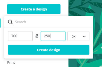
I recommend these larger dimensions because free Canva does not allow you to resize so you can make the logo larger than you need and scale it down later using free online software.
Once you create your design, you’ll be left with a screen that looks like this:
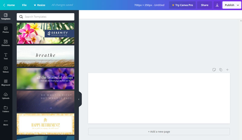
Now, most beginners using Canva immediately gravitate toward the premade templates.
I recommend steering clear of premade templates for your brand logo.
Lots of other people are using these templates and that means you’ll be sharing a logo instead of making your own unique creation.
Instead, in the following mini-tutorials I’ll show you how to create your own custom logo by following some simple design techniques…
5 Different Logo Design Techniques Using Canva (Mix & Match!)
As I go through each of these five techniques, remember, you can mix and match!
Make sure to remember logo design rules though – keep it simple, ensure the logo looks good in black and white and is readable when zoomed out.
Logo Technique #1: Mix Two Fonts Families (along with Font Sizes)
One really simple way to create a logo is to mix two fonts together. This creates a more interesting text logo than if you just used only one font-family.
Start by clicking the “Text” button and then adding a heading to your design canvas.
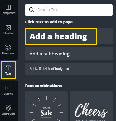
You’ll need to continue this step for each word in your logo that you want to appear differently. Canva will only allow one font-family and font-size per text box.
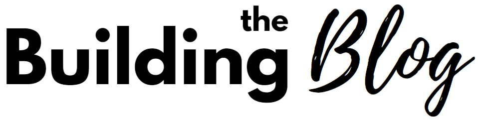
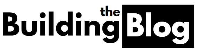
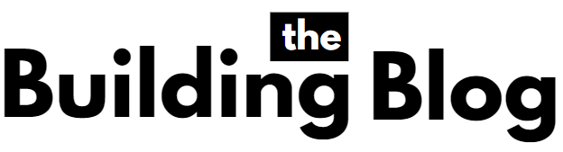
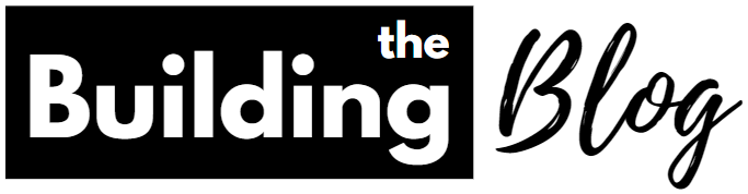
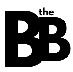
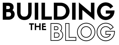
Here is an example of a reimagined Building the Blog logo in Canva using the Text tool. “Building the” uses the League Spartan font-family and “Blog” uses Playlist Script.
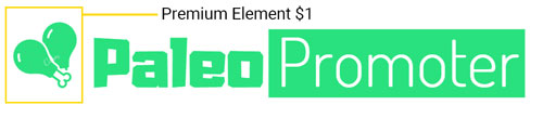
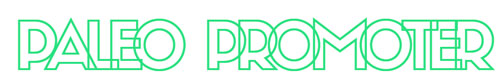
Here is another example I made for a fictional Paleo diet blog “PaleoPromoter.com”

This look uses the font “Aduma Regular” for “Paleo” and “Dosis Light” for “Promoter”.
Notice how I tried to use a prehistoric-looking font to represent the word Paleo.
Think about the meaning of your words as you choose a font. This will help bring a text-only logo to life. You may need to search a little longer for the perfect font, but it will be worth it.
And, as you choose the fonts you mix together, make sure they vary enough to be obviously distinct from one another.
Two fonts that are similar in both weight (boldness) and style will not look good together. You’re better off using the same font.
I suggest pairing a bold font with a light font. Or, one standard-looking font and one more decorative font. This will help you create a distinctive look.
And, Canva’s free version has a ton of free font options to choose from. You can even search using keywords to help you narrow down the choices.
Note that fonts with the crown icon are only available if you have Canva Pro.
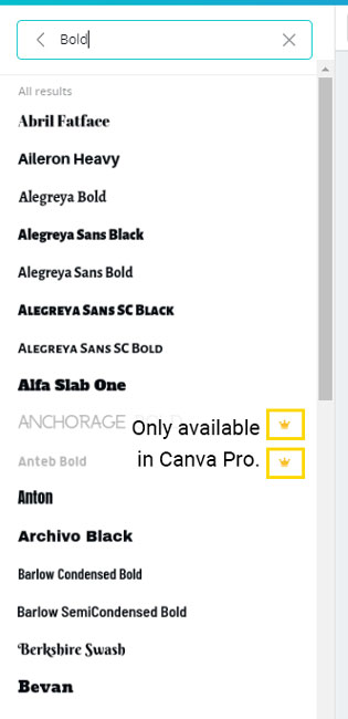
Here are a few of my favorite fonts that are available in the free version of Canva:
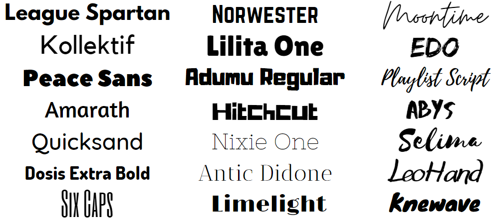
- League Spartan
- Kollektif
- Peace Sans
- Amarath
- Quicksand
- Dosis Extra Bold
- Six Caps
- Norwester
- Lilita One
- Adumu Regular
- Hitchcut
- Nixie One
- Antic Didone
- Limelight
- Moontime
- Edo
- Playlist Script
- Abys
- Selima
- Leohand
- knewave
Logo Technique #2: Incorporate Simple Shapes
Adding shapes is another really easy way to make your logo look like “more” than just text.
In Canva, find simple shapes under the Elements tab. I typically gravitate toward a simple square shape.
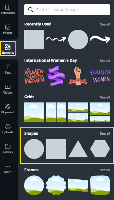
Start by adding some rectangles behind some of your text. This can completely transform the look of your logo and is super easy to do…
Just drag the shape onto your canvas and drag the edges to fit it around your words.
You can create a unique look by trying this technique around each word to see what looks best.
If you have a font that is significantly lighter than the other, it’s almost always best to put the shape behind the lighter font.
This keeps your logo balanced:

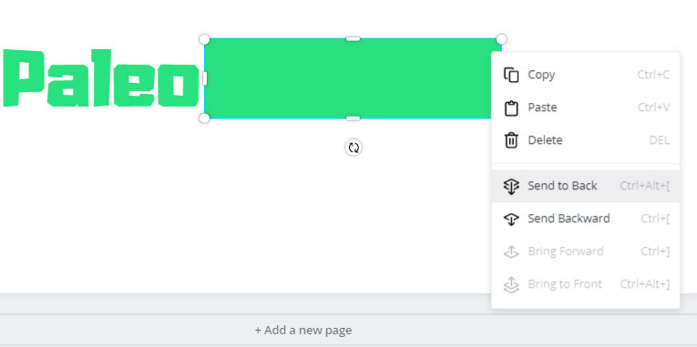
Pro Tip: if you ever have trouble with your shape covering up your words, you may need to alter the layer order. To do this, right-click the shape and choose “Send to Back.”
Also, try searching for some simple icons that you might be able to incorporate.
For this image, I searched for an arrow…
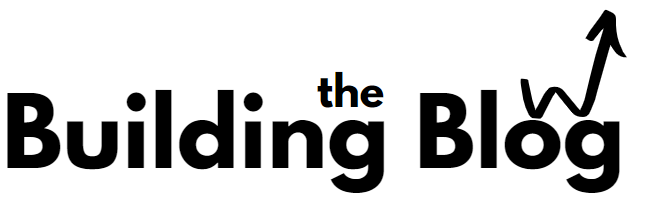
Canva has several free arrow shapes that I could add to my design. But as the search got more specific, free shapes were harder to find.
For the Paleo example, I tried searching “Meat.”
Unfortunately, for these more niche searches many of the elements cost $1 or require Canva Pro which is $10. Keep a lookout for the $ and crown symbols.
Again, be careful about adding icons that might become dated – I recommend sticking to one-color icons and symbols and avoiding clipart.
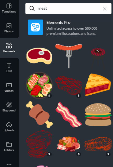
These multi-color icons are too complex for logo design and come off looking dated and amateurish.
Logo Technique #3: Make Use of Acronyms & Letters
If you do want to create a more traditional brandmark style logo, consider using the initials of your brand’s name.
This is technically still a lettermark logo, but gives the illusion of a brandmark.
Here are a few tips for using an acronym to form a logo:
- Overlap your letters
- Change the size
- Incorporate shapes

Pro tip: Using this technique is a great way to create a site icon (also known as a favicon) and can be used as a social media profile picture if you don’t want a photo of yourself.
Logo Technique #4: Combine an Outline Font with a Non-Outline Font
An outline font paired with a solid font is a great and easy way to add some variation to a simple logo.
Unfortunately, you can’t create outlines out of just any font using Canva, so you need to use built-in outline fonts. (Note that you can do this with Photoshop which is cheaper than Canva Pro)
There aren’t many outline fonts available on Canva, but I’ve found a few matching pairs:
- Siffon + Siffon Outline
- Lovelo + Lovelo Line
- Hussar Bold + Hussar Ekologiczy (not an exact match)
- Londrina Solid Regular + Londrina Sketch
If you want your fonts to match perfectly, your best bet is to use Siffon + Siffon Outline.
But, you can also mix fonts that don’t match to create an interesting logo.
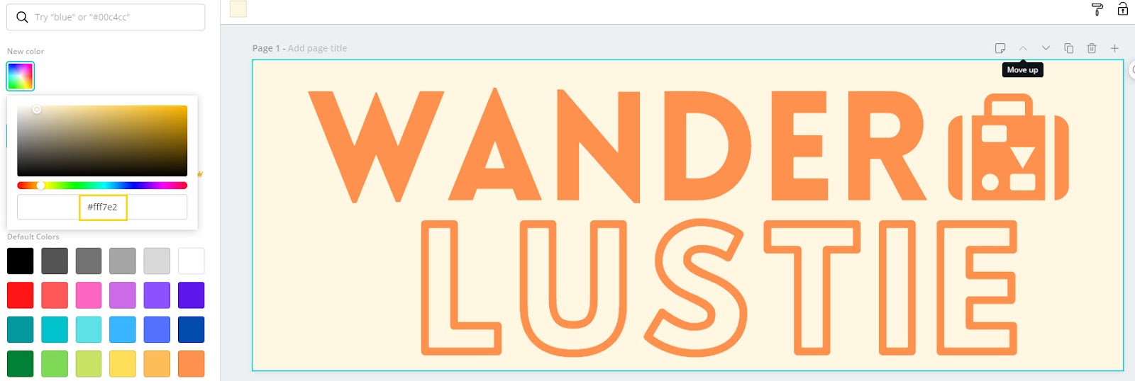
This font for the fictional travel website I created “Wanderlustie,” uses the font “Lovelo” for “Wander” and “Hussar Ekologiczy” for the outline.
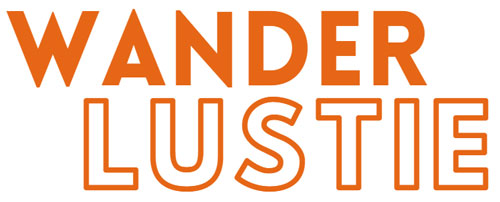
P.S. WanderLustie.com is an available domain name for any of you travel bloggers out there!
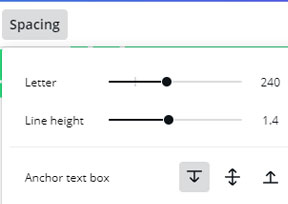
Logo Technique #5: Utilize Letter Spacing
The last design technique you can use is very simple… letter-spacing.
Select your text and try adding or subtracting letter spacing to create a unique look.
In this example, I added letter-spacing to my “Wanderlustie” logo:

And in this example, I contracted my letter spacing – I think this looks particularly interesting with outline text…
So there you have those are five different techniques you can use to create a professional logo for your blog or website.
And, remember, you can always mix-and-match techniques to add even more uniqueness to your logo.
Now, once you have your logo designed in Canva you may be wondering how you can export it?
Exporting Your Logo from Canva
One of my favorite things about Canva is there are no real size restrictions. Many free logo sites out there make it so you have to pay $19 to download your logo if you want it to be larger than 200px.
That being said, Canva will not allow you to download your logo as a transparent image unless you have the Pro version. This isn’t a big deal if your logo is already white.
But, if you have a different background for your header, you need to make sure the background of your Canva canvas is the same color.
You can either “Try Canva Pro” and get that transparent logo, or you can set the background of your canvas to the same color as your website’s header.
To do this, simply click the background of your logo, and click the multi-color icon at the top of the page.
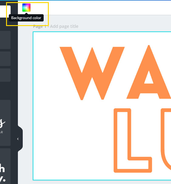
Now, you’ll need to enter the hex code of your website header’s background color to ensure they match exactly.
Now that your background color matches your header, you can download your logo.
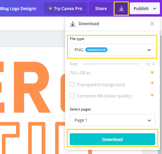
To download your logo, click the download icon at the top of the screen. Ensure PNG is selected and then click the download button.
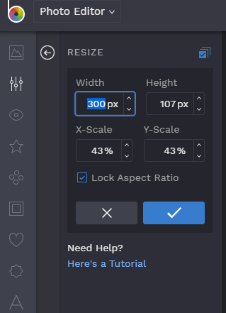
If you want to resize your logo with an online tool, try BeFunky.com/create.
You can easily upload your logo to this website and resize it to whatever (smaller) width you’d like without losing quality.
You can also always create a new Canva design and copy+ paste your logo and resize it manually.
Alright – that’s it! I hope you found this tutorial helpful and were able to design some amazing logos!
Let me know how it worked out for you in the comments – I’d love to see your creations!
Innovative thoughts! Good suggestions for designing a creative logo for a personal blog. I’ll definitely apply these techniques.
i never know the use of adobe shadow until i saw this post. thank you for this! this is very helpful.